Optimizing data mapping workflows to reduce configuration errors
Analytics and Reporting Configuration Tool

ROLE
Senior Product Designer
TEAM
Product Designers (2), Product Manager, SME, Engineering team
DURATION
6 months
CONTEXT
The Analytics and Reporting Configuration Tool (ARCT) is a data mapping tool that enables client teams to manage and organize employee data across clients and domains like benefits, payroll, and savings. It allows users to define how data is structured and displayed in reports and dashboards, ensuring the right information is surfaced for analysis and decision-making.
PROBLEM
The tool was scheduled to migrate to a more advanced software platform. With this transition, the design team was also asked to completely redesign the tool and the experience. User interviews revealed that the existing tool has lacked overall clarity and fails to support a broader range of user tasks, resulting in disorganized and inaccurate display of data in reports and dashboards.
FOCUS
The focus of this project was aimed at redesigning a data mapping tool that reduces mapping errors through interactions that simplifies workflows and clarify user tasks.
RESULTS
This project launched successfully to 300+ clients, improving overall usability by 66%. From a design perspective, the work Reduced friction, accelerated decision-making, and strengthened user experience by embedding empathy, user goals, and clarity into every stage of development by working closely with product and engineering.
User interviews
As the senior designer on this project, I guided the associate designer in conducting interviews with current ARCT users. The goal was to establish a baseline understanding of:
Tool usage and workarounds
User pain points and challenges
Areas of opportunity
We synthesized the findings through a thematic analysis, which proved to be an effective and concise method for capturing meaningful insights. Some key takeaways include:

Difficulty organizing and navigating datasets
Users struggle to manage and locate information within the tool due to the large volume of datasets


Lack of clarity around terminology and functionality
Many users do not fully understand certain terms, features, and interactions within the tool, even with training

Reliance on external workarounds
Users often resort to performing tasks outside the tool, which is time-consuming and inefficient
Product collaboration
We organized all thematic findings into actionable opportunities, categorized as design, technical, and non-design. Each opportunity was then reframed into “How might we” statements to guide solution ideation. Our PM and SME appreciated this dual perspective because it clearly highlighted the actions needed and made the next steps easy to prioritize.
As a workshop activity with the PM and SME, we conducted a prioritization matrix using the “How Might We” insights. The matrix was based on user importance and urgency, helping us realistically determine what needed to be addressed from product, design, and user perspectives. This exercise was highly productive, enabling the design and product teams to collaboratively align on feasibility and establish a clear roadmap for the tool project. Some areas of high prioritization include:
How might we reevaluate the navigational structure for a more organized flow
How might we provide meaningful ways of organization so users can find the data they need
How might we include functionalities and features that guides users to decrease error and increase efficiency
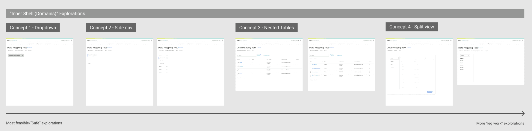
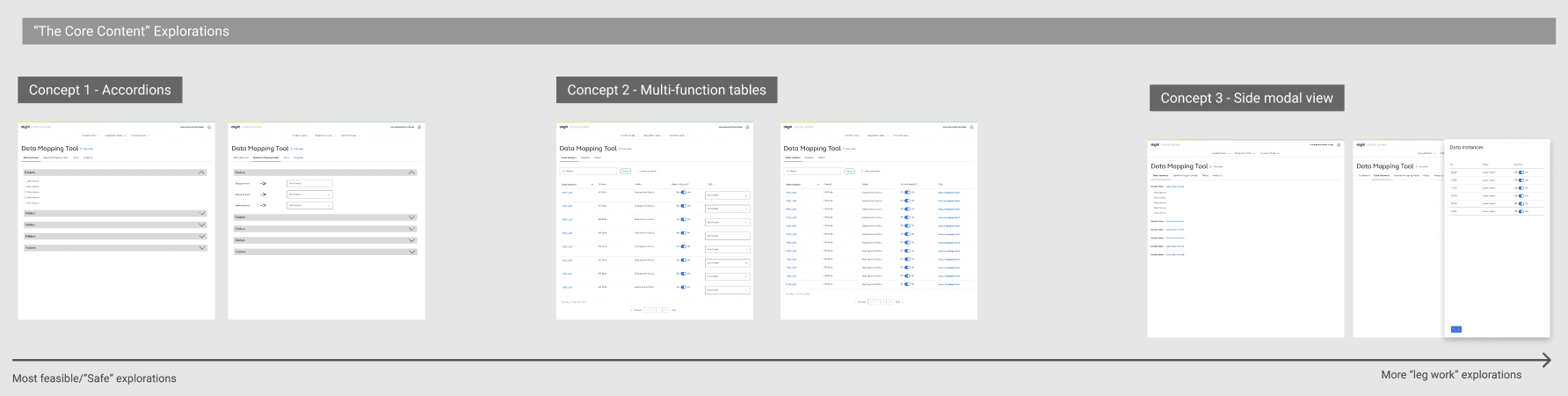
Building the layers
Due to the tool’s complexity, I guided my designer to think of the prioritized How Might We statements as layers of the experience: the outer shell representing the main navigation, the inner shell representing secondary navigation, and the core representing the primary content. This approach helped the designer focus on one layer at a time and explore a wide range of solutions.
It was important to organize the explorations from the most feasible to those requiring greater effort so that teams can quickly assess development trade-offs and make informed decisions about how far to push the product while still meeting delivery goals.
Final designs
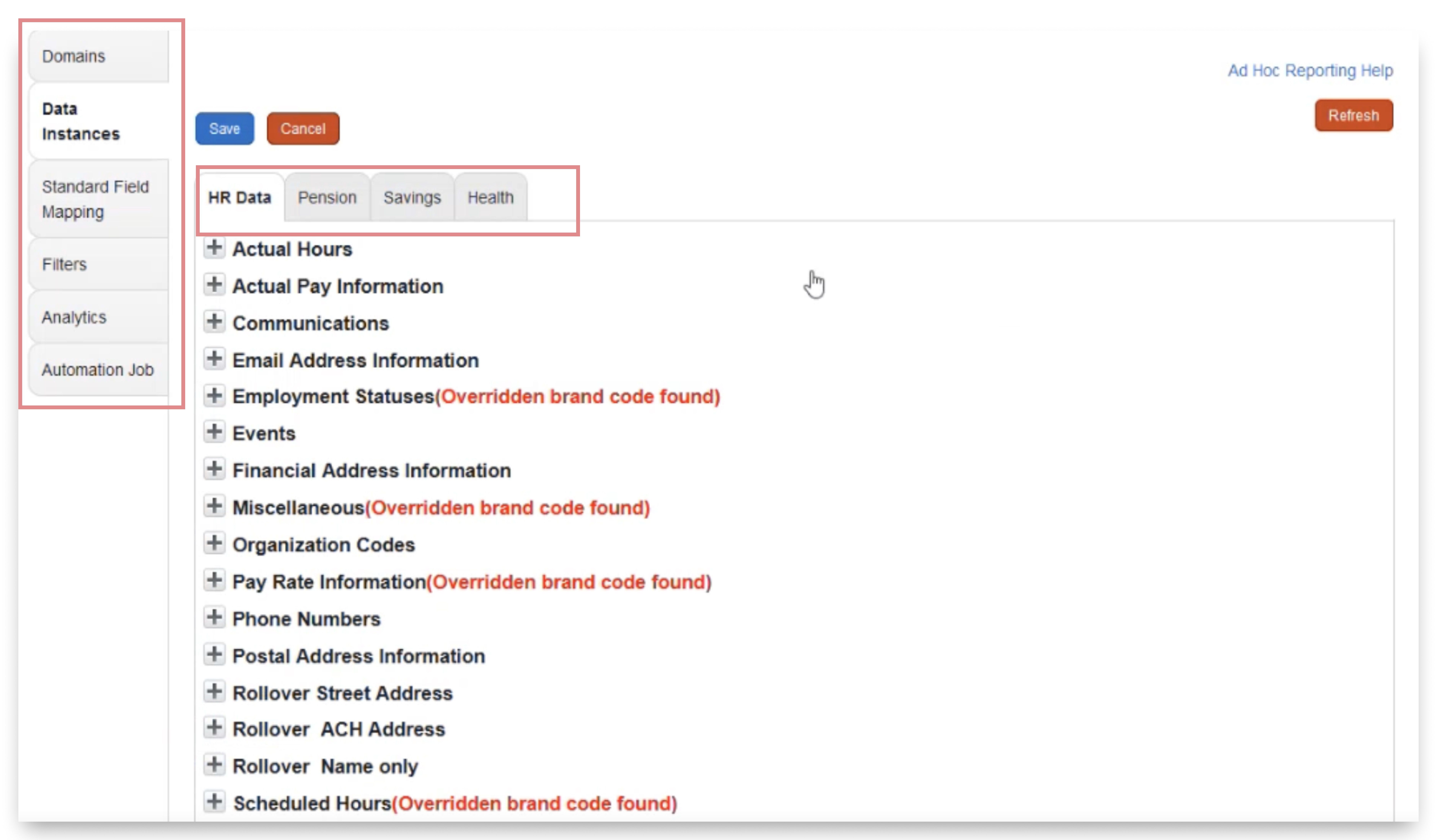
Dual navigation caused confusion among users
Users didn't understand how the two navigation elements worked together
Many assumed they needed to move through the left rail options in sequential order (which is not the case)
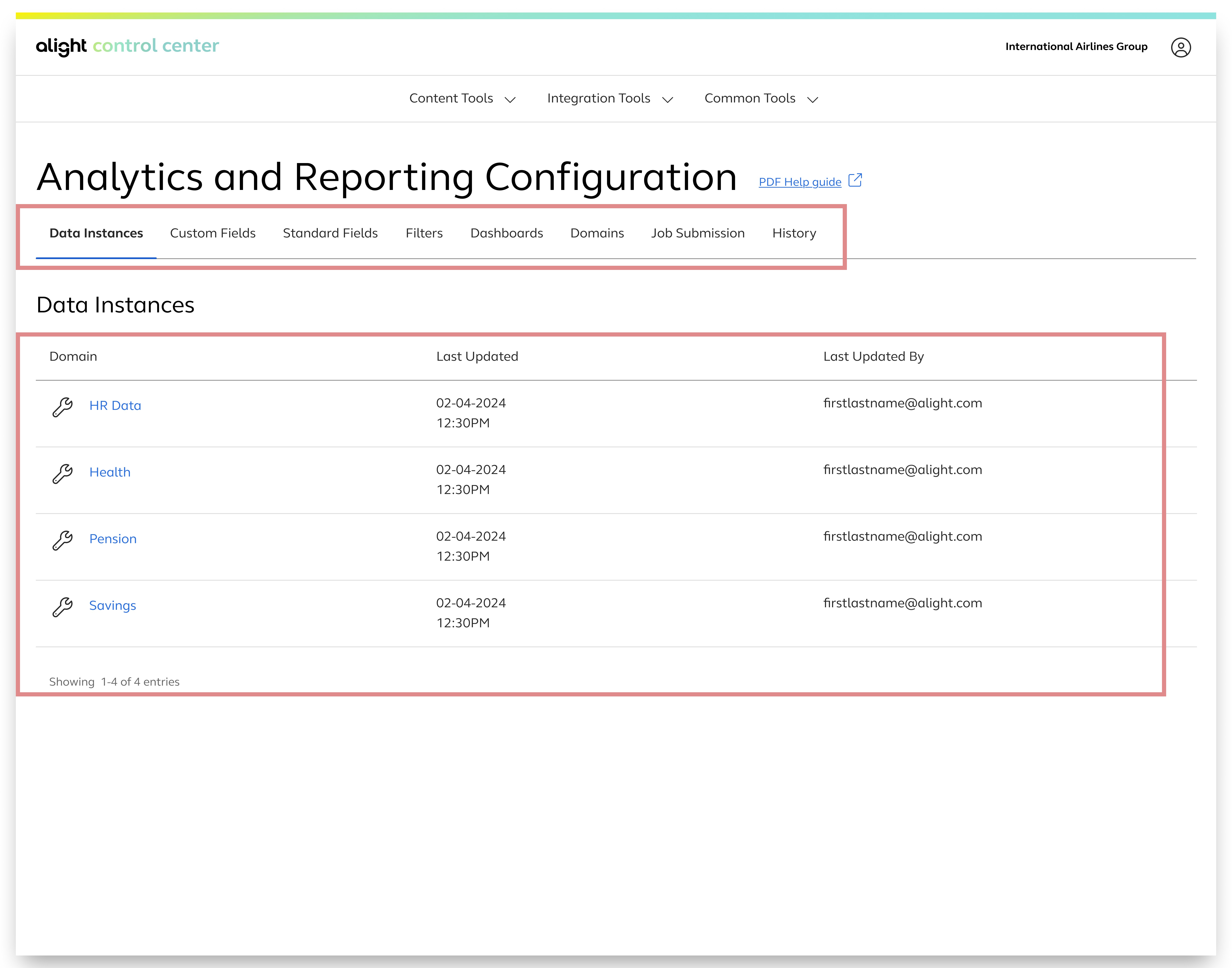
Clear separation of navigation
The top tabs as the main navigation helped users understand clear hierarchy
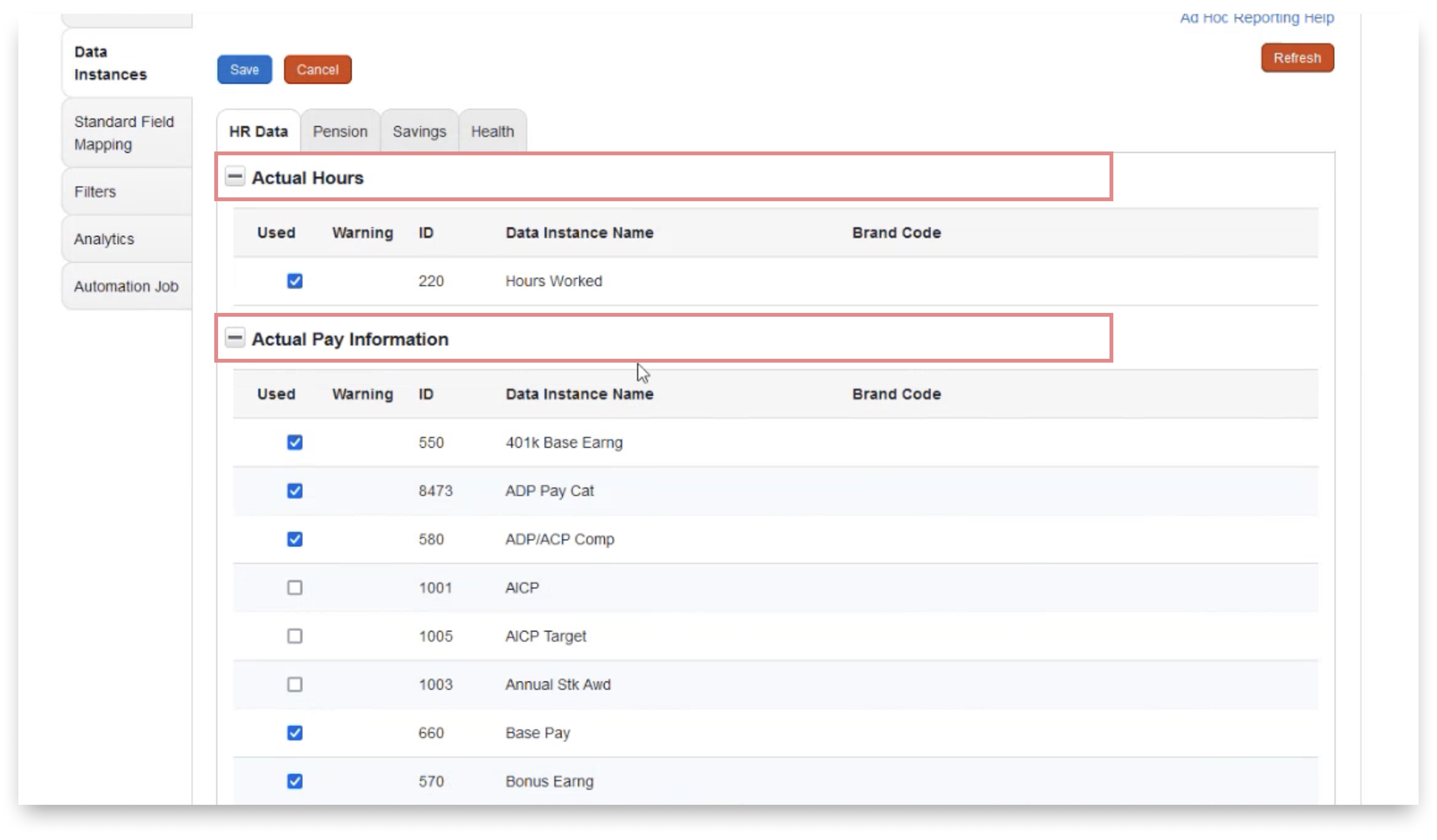
Unclear breakdown of data and interaction
The combination of multiple navigation layers and collapsible sections made it difficult for users to navigate to find the desired data and understand their location within the interface
Users were unclear that each section could expand or collapse to reveal all data
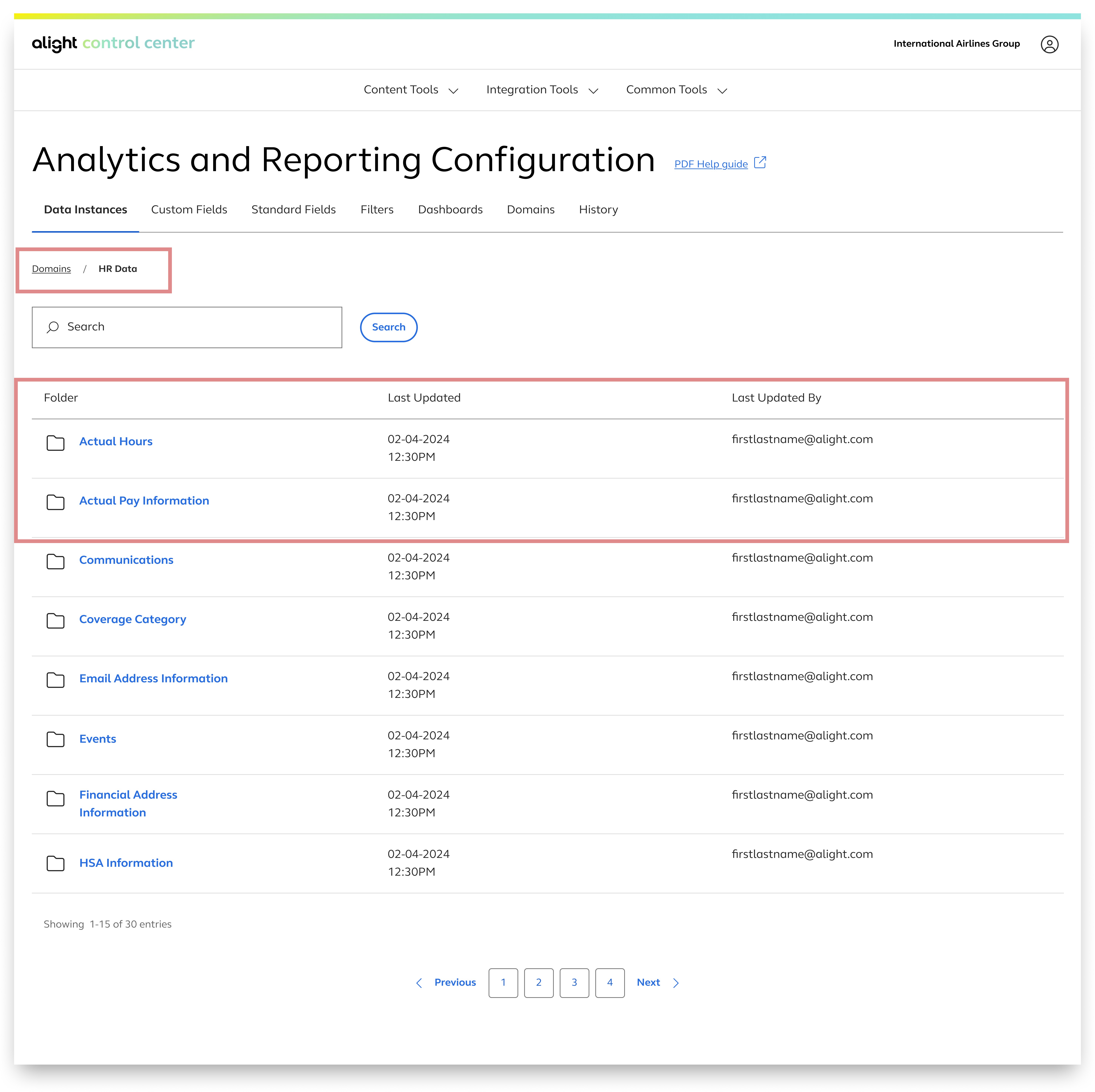
Intentional and defined guidance to data
Each section was placed within a nested table, allowing users to click in and view more data in an organized way
Breadcrumbs were added to help users understand how many levels deep they are within the navigation
How might we include functionalities and features that guide users to decrease error and increase efficiency
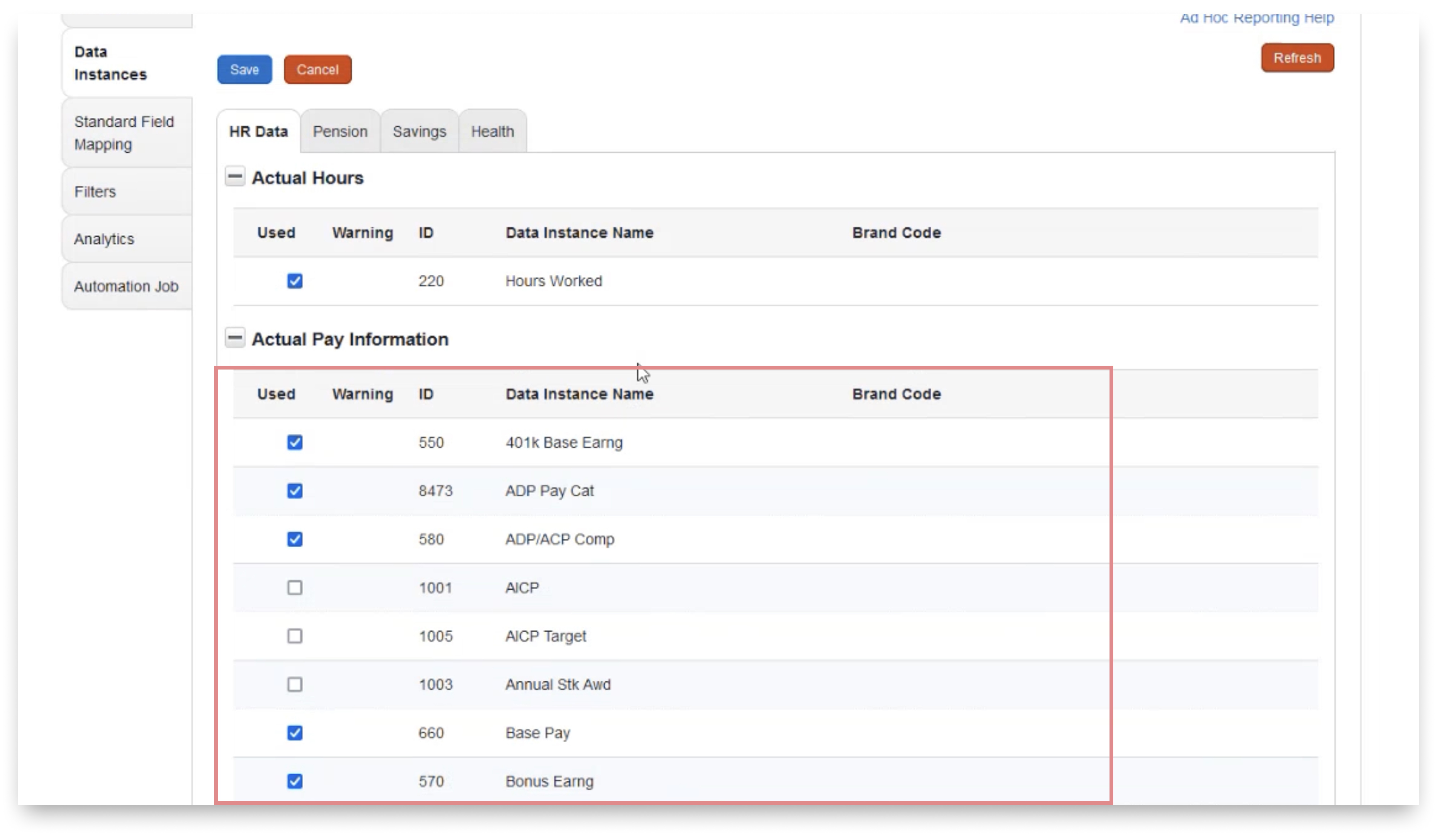
Dense data with little wayfinding
Some sections contained nearly a hundred data items, making it difficult for users to search efficiently
Because each section was expandable, the page often turned into an endless scrolling experience
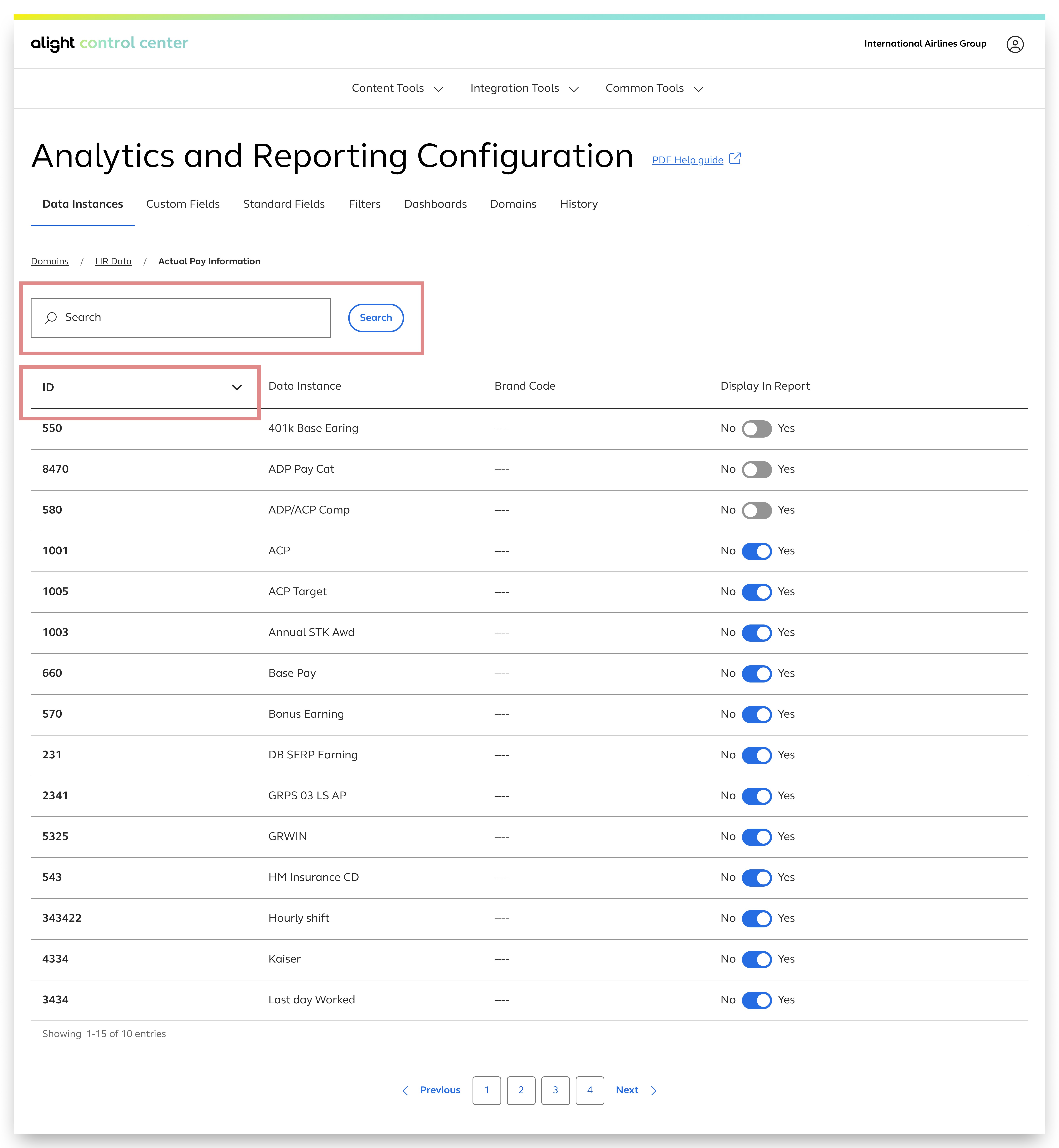
Improved data discoverability
Each section includes a search bar, and the data is displayed in tables with sortable columns for easier searching and finding
Pagination was included to alleviate any accessibility and usability concerns with endless scrolling
Impact
We conducted moderated usability testing to evaluate users’ ability to define data sources within reports. 12 participants, selected from diverse client teams, each completed a set of 8 tasks. 10 participants succeeded, resulting in a participant success rate of 83%, which indicates strong usability for this workflow.
Insight: This success rate indicates strong learnability and clarity in the workflow design, validating that the interface effectively supports users in completing a critical configuration tasks with minimal friction and confusion.
Challenges and learnings
Insights into action
Rather than simply presenting user interview findings to stakeholders, we added value by providing actionable solution prompts for each insight. This approach demonstrated how our work contributes to overall product strategy, strengthens stakeholder partnerships, and drives efficiency.
"Solutioning" through technical limitations
As development began, the number of technical roadblocks was unexpected. Despite having approved and tested designs, the team encountered issues due to technical limitations, time constraints, and resource challenges. Whenever we hit a roadblock, my designer and I created alternative solutions. We soon realized that providing multiple design explorations upfront was both time-efficient and helpful. Although it was challenging to consistently anticipate obstacles and think beyond the obvious, this approach proved our ability to innovate and look beyond the immediate task.