Scaling data insight with a standardized visual system
Worklife Insights
ROLE
Lead Product Designer
TEAM
VP of Product, Project Managers, Design lead, Design Director
DURATION
6 weeks
CONTEXT
Alight Worklife Insights®️ is an analytics platform designed to help clients make sense of employee data across benefits, payroll, savings, and more. Within the platform, users can access reports, structured collections of employee data, or dashboards, which present that data through meaningful visualizations like charts and graphs to support deeper analysis and decision-making.
PROBLEM
The platform currently lacks standardized guidelines for creating visuals and graphs, leading to inconsistent data representations across client teams, domains, and services. While a data visualization palette exists within the design system, it doesn't support the complexity and density of analytics use cases. The limited color range restricts scalability and differentiation across diverse chart types, making it challenging to maintain visual clarity, consistency, and accessibility in data-heavy environments.
FOCUS
The focus of this project was to establish standardized design guidelines and rebuild a cohesive data visualization palette for dashboards, ensuring that charts and graphs were consistent, accessible, and visually engaging.
RESULTS
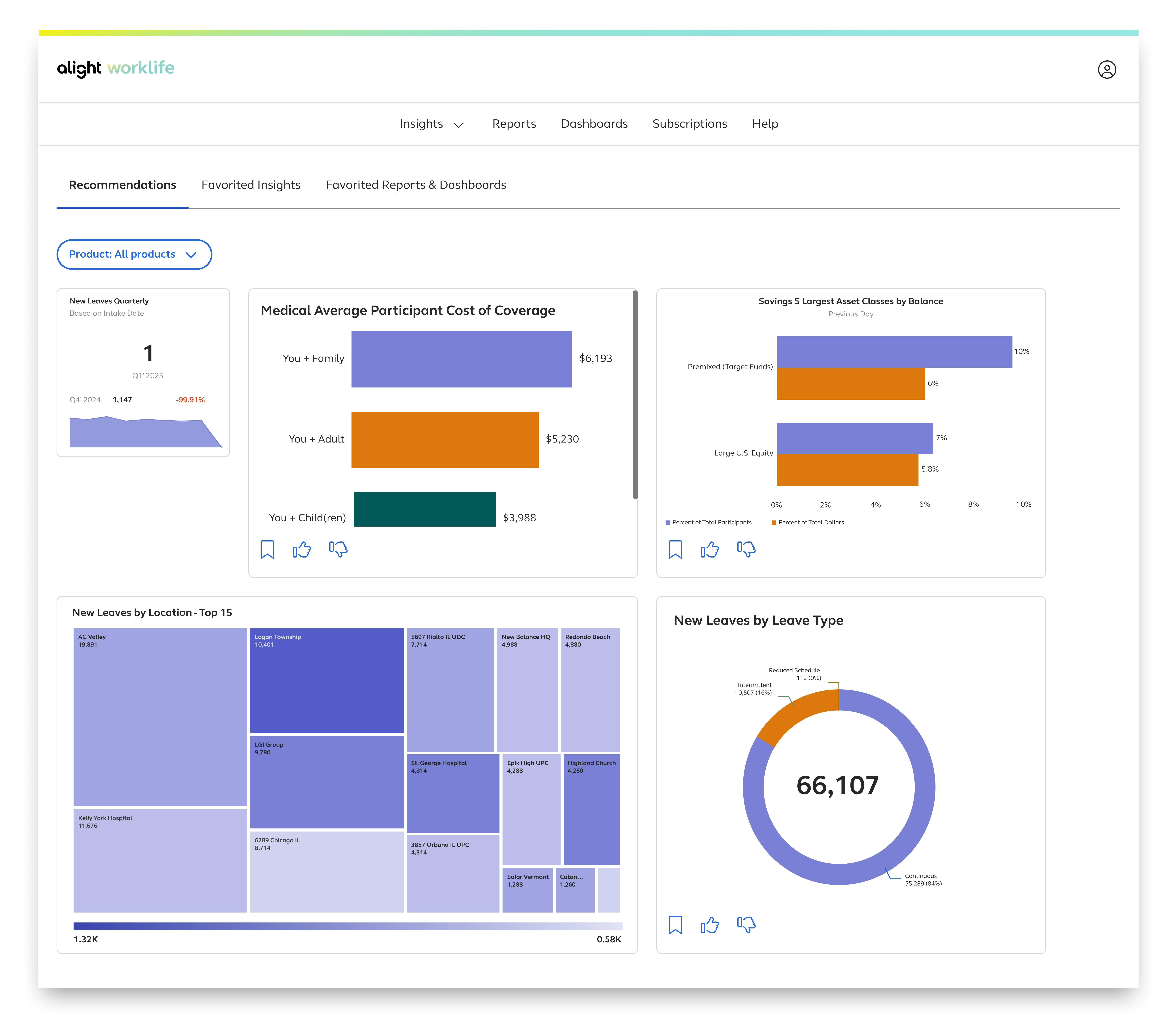
This project launched successfully to 269 clients, with research indicating that users were able to interpret the data using the new color palette with 95% accuracy. From a design perspective, this project enhanced the existing data visualization palette by improving the visual appeal and expand its versatility, while upholding accessibility standards.
Early feedback
Following the beta release of Alight Worklife Insights, we conducted feedback sessions with clients, stakeholders, and end users to gather direct input on their experience with the platform. From these sessions, 2 large, recurring themes emerged, reflecting shared needs, pain points, and opportunities for improvement:
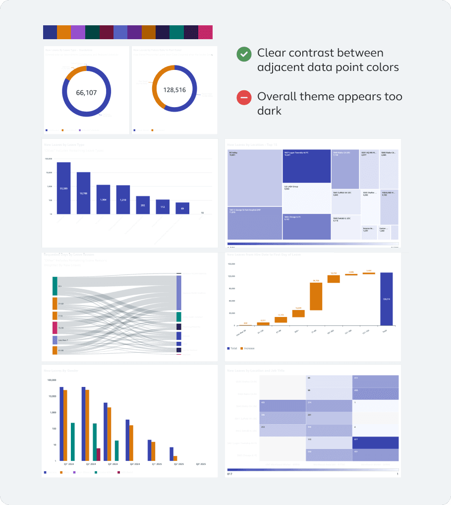
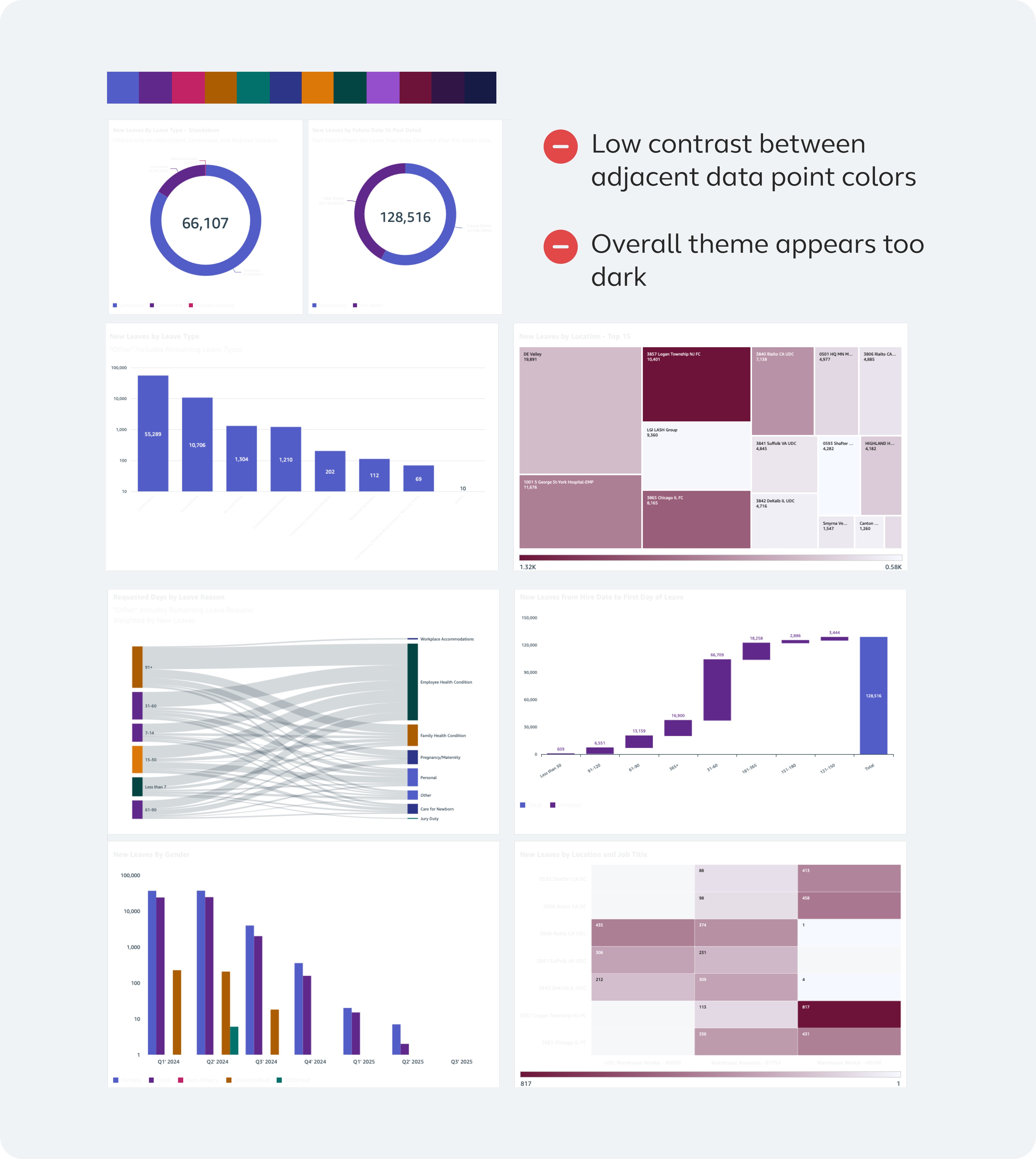
COLOR
Although the data visualization colors were sourced from our design library, users shared that the palette felt overly dark and lacked visual appeal, making it harder to engage with the dashboards effectively.
CONSISTENCY
The dashboards lack visual consistency, making it difficult for users to quickly scan and interpret information. Text sizes vary significantly—some are too small, others too large—and chart styles are inconsistently applied, leading to a fragmented and confusing experience.
PART 1: COLOR
Where it started: original color palette

Categorical palette
Limited color variety which is unsuitable for complex visualizations with many distinct categories
Sequential palette
Sequential palettes require a minimum of 10 steps (5 light, 5 dark) to show clear data progression and gradient, and is used for readability across themes,
Diverging palette
There is an Insufficient range that limits smooth transitions and granularity for accurate central-value visualization.

Overall
There is a lack of meaningful color relationships which weakens the appearance of a unified color system.

Building a more effective color system
I continued researching how to build a more robust and effective system. While creating a new color palette might seem straightforward, it’s actually a nuanced process, much like crafting a recipe. It involves carefully balancing multiple components including:
Accessibility standards
Principles of color theory
Relationships between different color schemes
Step 1: Establishing the narrative
Before technical research began, I established a clear narrative linking the new color palette to Alight’s brand identity, reinforcing that the choices were intentional rather than arbitrary. This helped build stakeholder confidence and address concerns about aesthetic appeal by grounding the palette in an existing brand.
Step 1: Defining the foundational colors and sequential palette
The hues that were inspired by Alight's brand are the foundation to the overall color palette. Out of these 5 hues, the sequential, categorical, and diverging palette are derived. Together, these colors define the tone, color scheme, and visual identity of charts and graphs.

Step 2: Curating a diverging palette
There are two common types of diverging color palettes: those that move from cool to warm colors, and those that stay within cool tones. These palettes are useful for showing differences in data, such as changes in direction, strength, or contrast.


Step 3: Methods to a categorical palette
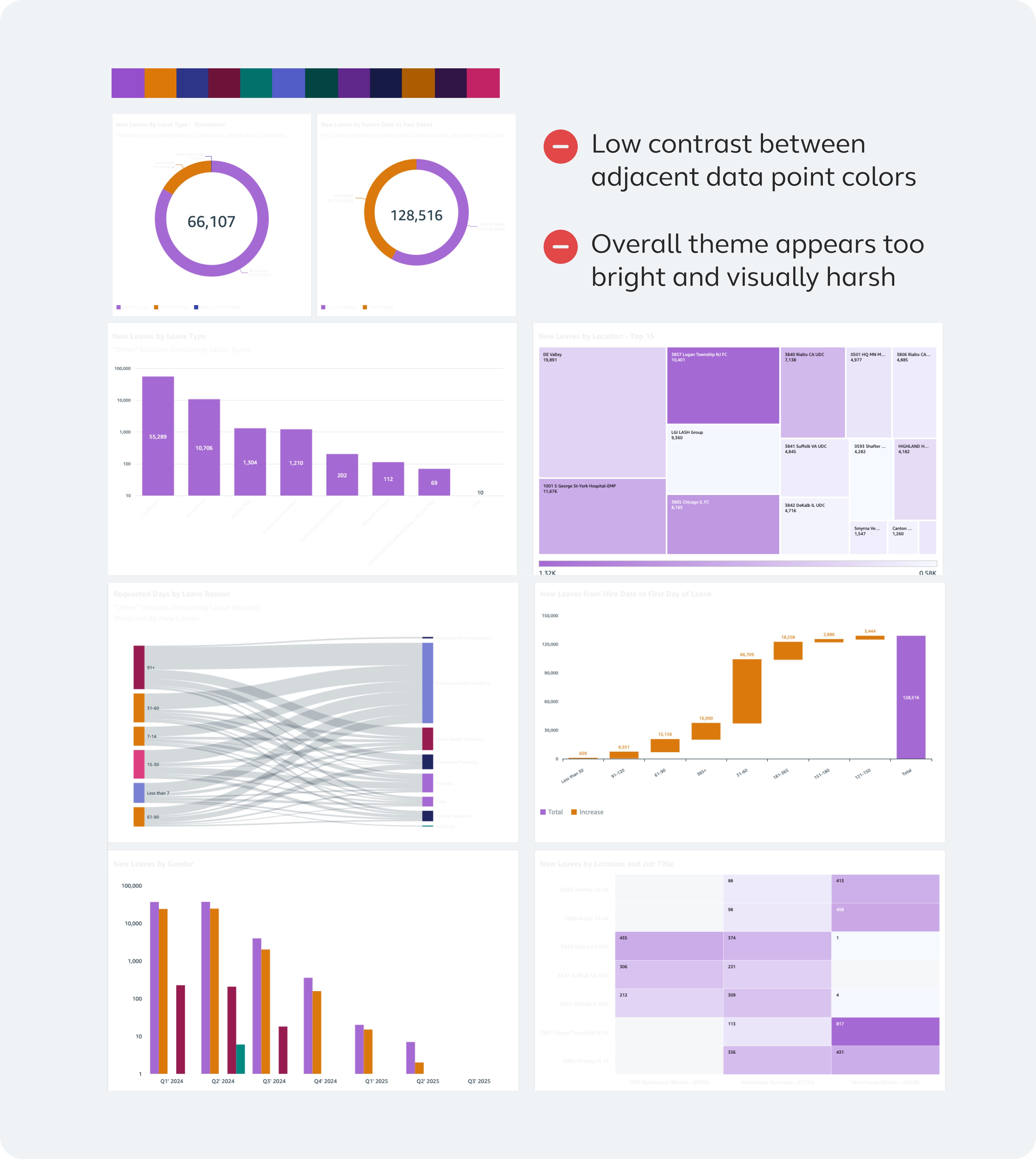
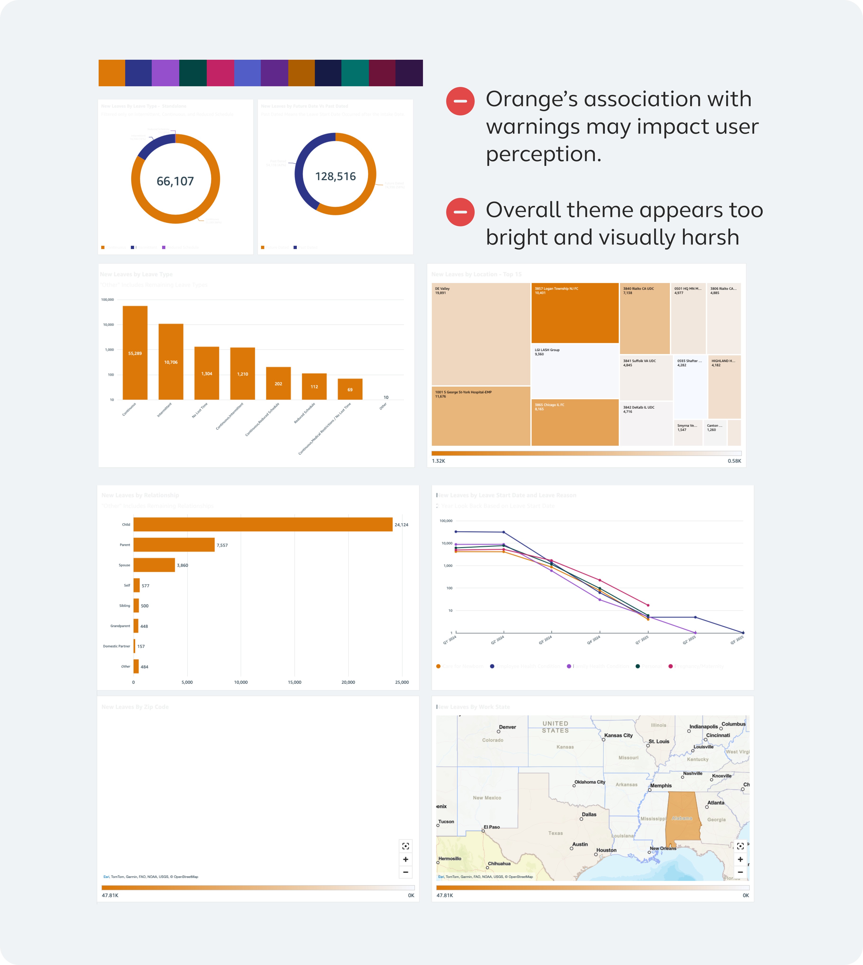
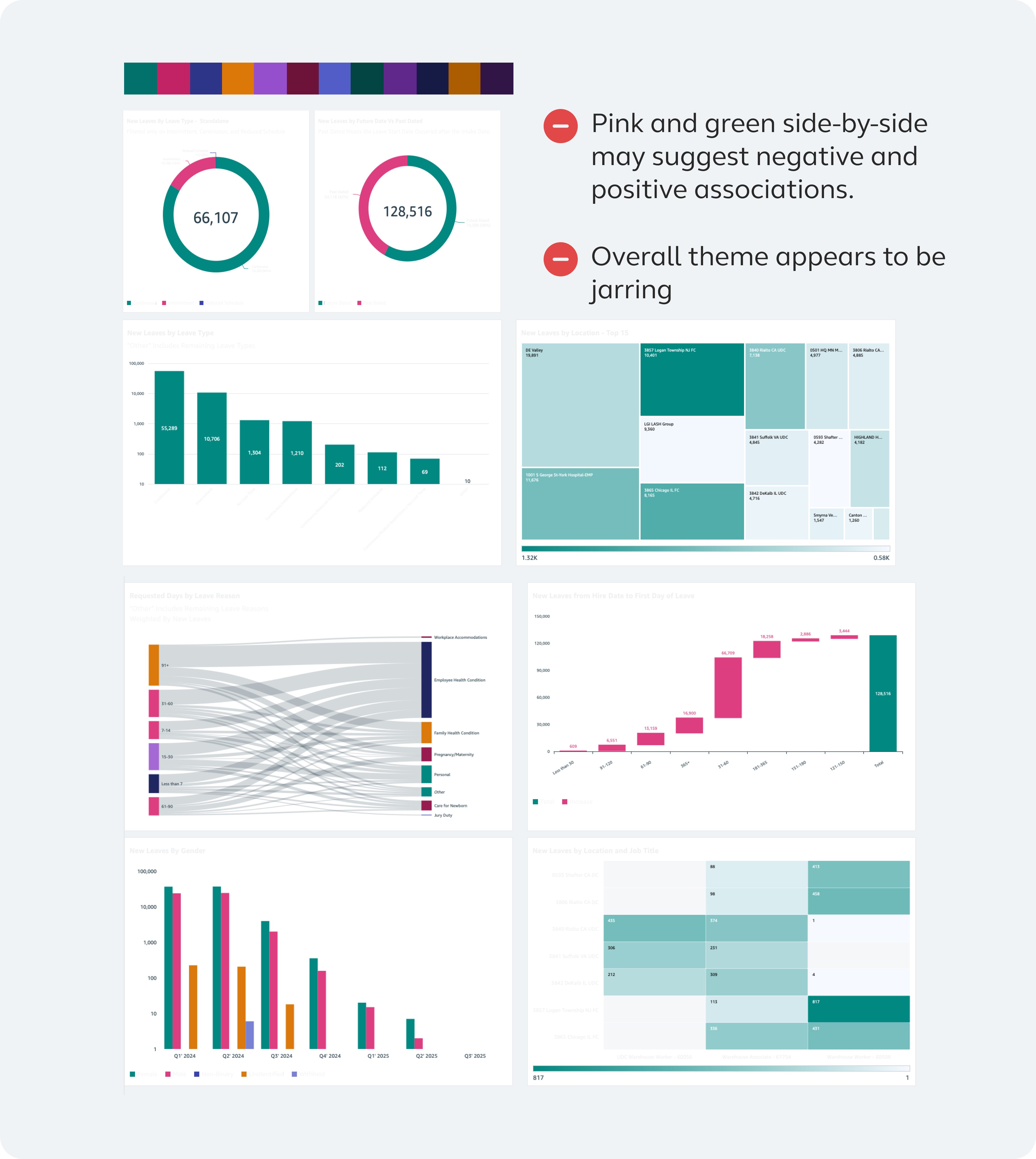
In my research, I found two particularly thorough approaches used by Amazon Cloudscape and GitLab Pajamas. Both techniques aim to maximize contrast and variety within a categorical palette. This will ensure clear visual differentiation between adjacent and sibling elements within charts and graphs.
While both methods proved effective, I ultimately chose to move forward with the method that produced a brighter palette due to its narrower range of skipped tones, which aligned more with user feedback, specifically, the desire to avoid darker, more muted colors.


Step 4: Structuring a harmonious color scheme
To minimize custom color selection for graphs and maintain visual consistency, I established a defined color set and scheme organized into a clear, strategic structure. This provides guidance on when and how each color should be applied in charts. The most effective arrangement was determined using principles such as color theory, contrast, and visual appeal. Below are stress tests that were performed:
The Refined Color System

Categorical palette
Ample range that accounts for many distinct categories in complex visualizations
Sequential palette
Sufficient range that allows for clear data progression and gradient
Diverging palette
Flexible range that allow for directionality, strength, or contrast in data

Overall
Clear relationship between each palette type without compromising accessibility, color theory, and visual appeal

PART 2: CONSISTENCY
Identifying dashboard inconsistency
The next area of evaluation focused on the visual consistency of the graphs and charts. This includes elements like titles, layouts, and the graphical styles. It became clear that the dashboard lacked a cohesive visual language, resulting in inconsistencies that undermined its overall integrity.
I worked with the engineering team and project managers to compile a comprehensive library of all potential graph and chart types and prioritized the ones that would appear on the users' end experience. I then conducted a detailed analysis to identify patterns, discrepancies, and areas for improvement. Some of the key high-level observations include:
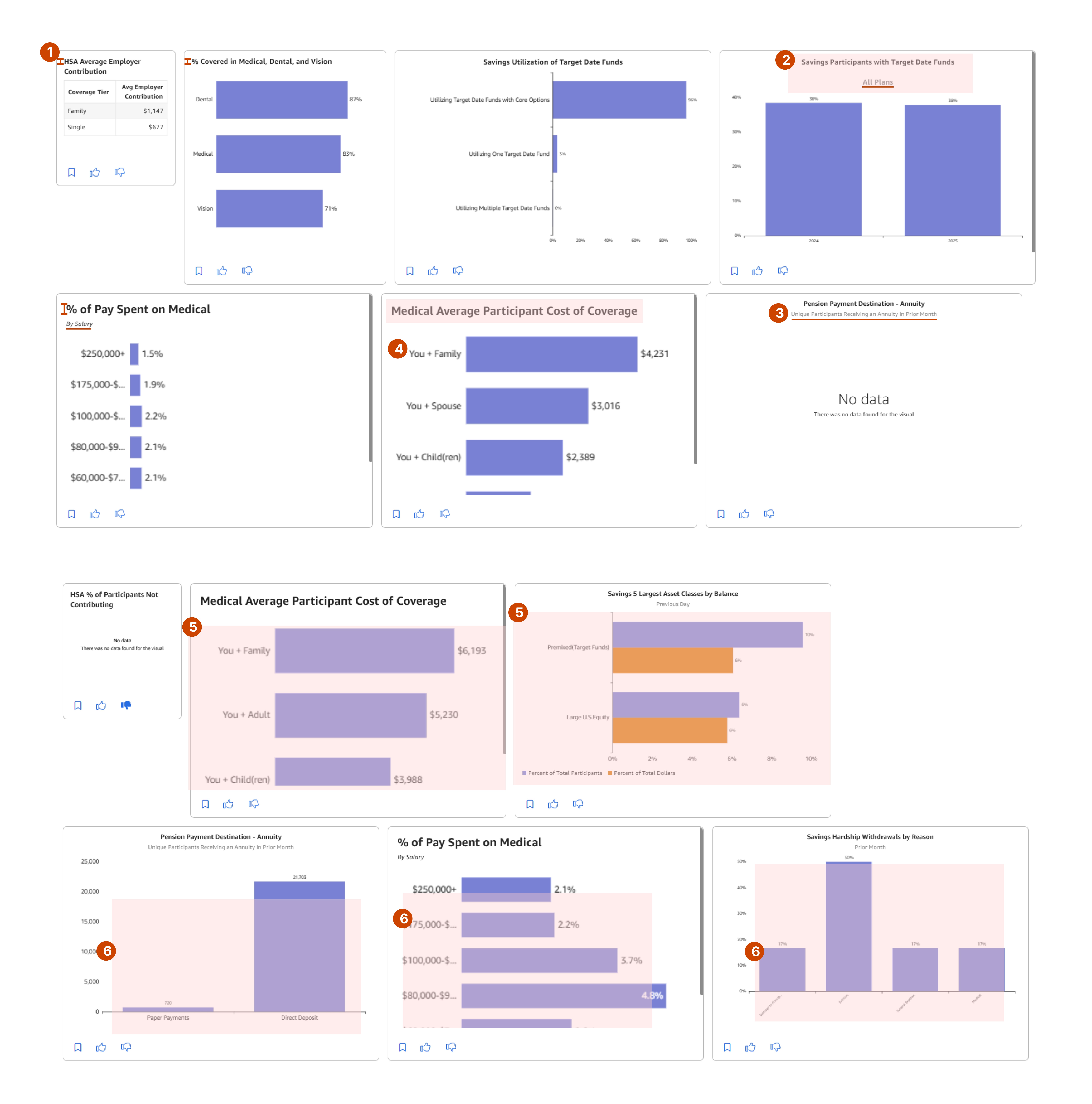
Inconsistent heading structure
Title and subtitles varied in size, placement, and alignment, leading to a lack of uniformity
Inconsistent graph labeling
Graph legends, axis labels, and values differ in styling and positioning, creating visual noise
Inconsistent graph usage
Horizontal and vertical bar graphs were applied inconsistently which affects the effectiveness of the data presentation
Non-uniform cards
The visual containers (cards) vary in 3+ width sizes and did not align consistently, which disrupts the integrity of the grid layout
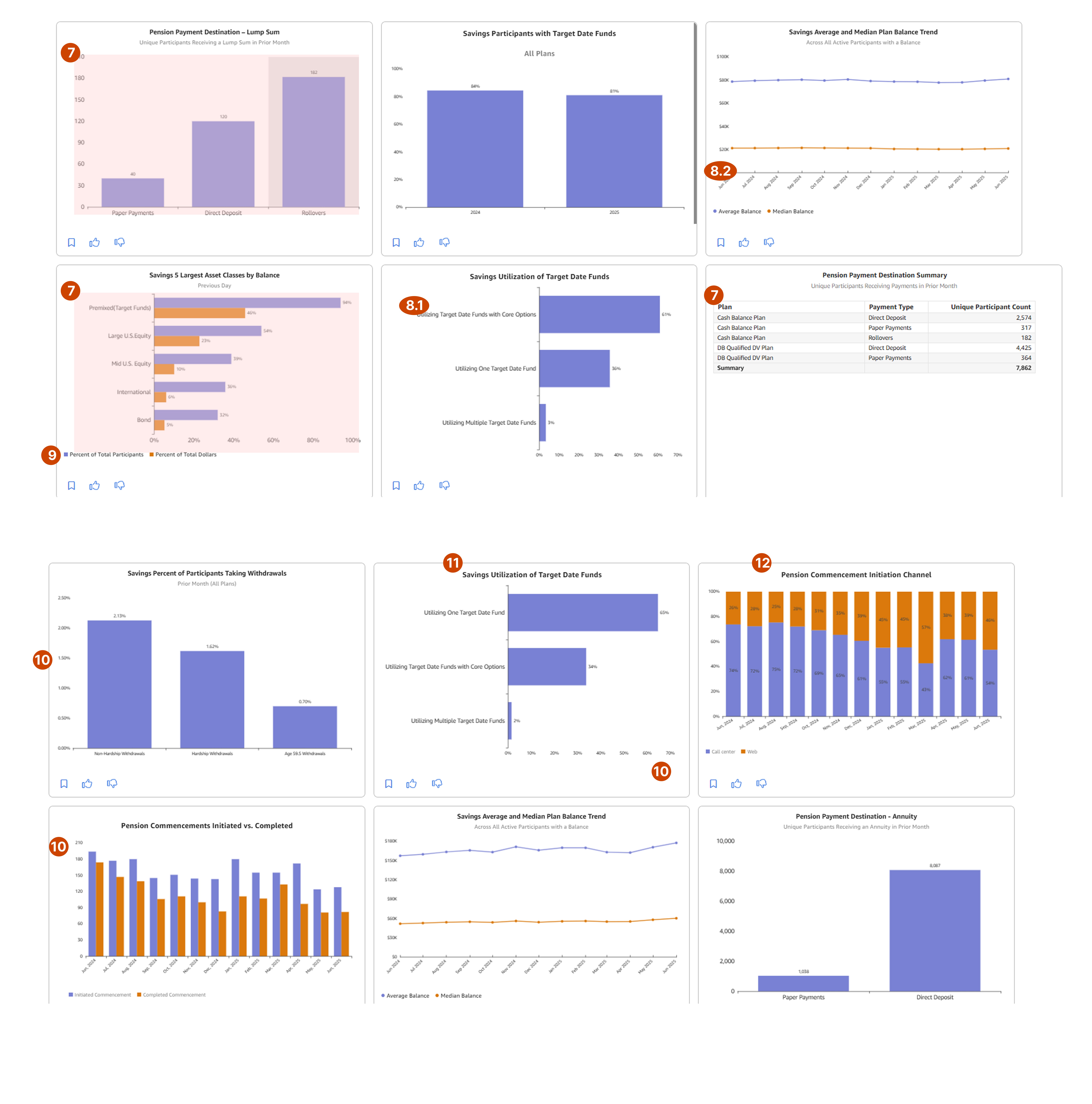
Driving dashboard consistency
BEFORE

AFTER

All visual components, including titles, graphs, and legends, are left-aligned to enhance readability
Titles are set in 16px bold, while subtitles use 16px regular for clear hierarchy
Two set widths of 330px and 683px were proposed to maintain a grid layout
BEFORE

AFTER

Graph text elements (e.g., axis labels, legends, data labels) are standardized at 12px for improved legibility
Horizontal graphs are used to represent progressive data, while vertical graphs are reserved for categorical comparisons
BEFORE

AFTER

For vertical graphs, axis labels are right-aligned and wrapped to optimize space
Metric labels are omitted unless the graph is a line chart; instead, precise data points are clearly labeled for accuracy
Impact
Client feedback
Alight Worklife Insights is used by 235 clients. We have received early feedback from some of our clients:

Usability testing
We conducted usability testing to evaluate the effectiveness and accessibility of the newly designed color palette for our analytics dashboard. The goals were to ensure that the colors were distinct and interpretable across various chart types and user contexts.
Results:
Participants correctly identified chart categories with 95% accuracy, indicating strong perceptual distinguishability.
Subjective feedback highlighted that participants found the palette visually appealing and easier to read, particularly in high-density charts.
Insight: The new color palette demonstrates high usability across typical dashboard scenarios. It enhances both data comprehension and visual clarity, providing an effective experience for users.
Challenges and learnings
Stakeholder feedback
The biggest challenge was partnering with stakeholders who prioritized making the color palette look “pretty” to address client concerns. While I ensured visual appeal, my focus was creating a future-proof, effective palette. Clear communication and explanation of the rationale and process helped shift the conversation from aesthetics to the thoughtful design behind the decisions.
A key conversation that helped shift focus from aesthetics alone to an effective palette was framing a narrative that emphasized the why behind the choices, not just the how.
Start to systems design
This was my first project where the emphasis shifted from experience design to system creation and standardization. Over several months, I explored, researched, and iterated to develop the initial color palette and dashboard standards. The biggest challenge was navigating the abundance of options without getting stuck, and making confident, strategic decisions.