Simplifying complex reporting with Gen AI
Alight Assistant

ROLE
Lead Product Designer
TEAM
VP of Product, Project Managers, Developers, Design lead, Design Director
DURATION
6 weeks
CONTEXT
Alight Assistant is a generative AI chatbot embedded within Alight Worklife Insights®️, an analytics platform designed to help clients make sense of employee data across benefits, payroll, savings, and more. This AI-powered experience serves as a virtual assistant, streamlining complex workflows and enhancing user interaction within the analytics tool.
PROBLEM
Alight Worklife Insights is a robust analytics platform, and configuring new or existing reports—structured sets of employee data—can require multiple steps and significant effort. The problem that we were faced with is how might Alight Assistant help streamline these workflows, enhance efficiency, reduce complexity, and improve overall interaction with the reporting process.
FOCUS
The focus of this initiative was to explore how users might search for, modify, and create reports more intuitively and efficiently through the assistant.
RESULTS
This project launched successfully to 269 clients, improving overall client satisfaction and experience while reducing reporting turnaround time by 20% through the Assistant. From a design perspective, the work also helped establish Alight’s foundational AI Design System, defining core principles for styling, interaction patterns, and visual consistency across AI-powered experiences.
Kick-off
I partnered with the development team and project managers to:
Align on user goals and client needs/expectations
Understand technical limitations
Asses feasibility
Review the data model
Consider time constraints for the initiative
To ensure cross-functional alignment, we co-created a user journey diagram that mapped out key interactions and functionalities within the AI experience, helping teams stay grounded in a shared vision.
Explorations and development
As a foundational effort, these are the key questions that guided the explorations, designs, interactions. and development.
How will users trigger the AI?
There are several ways users can trigger the AI, such as through a floating icon, a static button, or automatic activation. The challenge was identifying the most effective entry point while balancing visibility and accessibility.

Floating icon
Appeared as an unstable anchor for the assistant, increasing the risk of discoverability issues
Page level access
Competed with other page content, which resulted in it being minimized and overlooked

Global navigation access
Attention is drawn to the assistant without disrupting users' workflow and is accessible across pages
How should the AI be laid out?
Given there are a variety of experience sizes the AI could occupy, such as a chat bubble, side pane, full page, or modal, I determined the most appropriate size based on the content and level of input/effort needed by the user.
Modal
Primarily suited for simple, lightweight chats or inquiry-based interactions
Side-pane
Provides flexible pattern to transition between small and large layouts
Full screen
The large, immersive size allows for advanced tasks and scalability

While a side-pane layout offered greater flexibility, collaboration with engineering surfaced implementation considerations around responsive behavior, state management, and accessibility that could not be fully addressed within the project timeline.
With alignment from product and project management, the team agreed to defer this pattern as a future enhancement and deliver a full-screen experience for the initial release.
How should the AI look, feel,…
From the color palette to the AI avatar and user input bubbles, every design element was crafted to align with our design principles and system.
Iteration 1
The overuse of purple to denote intelligence caused visual overload
Iteration 2
Boxing each response created a chat-like experience and also added to visual clutter
Final iteration
Visual balance was achieved through the sparing use of AI-specific colors and icons, creating visual lightness against intensive tasks
…and behave?
We designed a flexible and versatile AI assistant that could provide clear, distinct pathways to conversation-driven user engagement.


Clear guidance
Assistant provides clear guidance to help users understand what tasks they can perform
Personalized suggestions
Assistant provides a personalized experience to users' needs based on users' interactions
Open-ended responses
Assistant engages with users in a natural, conversation-like style
Any notable interactions and patterns?
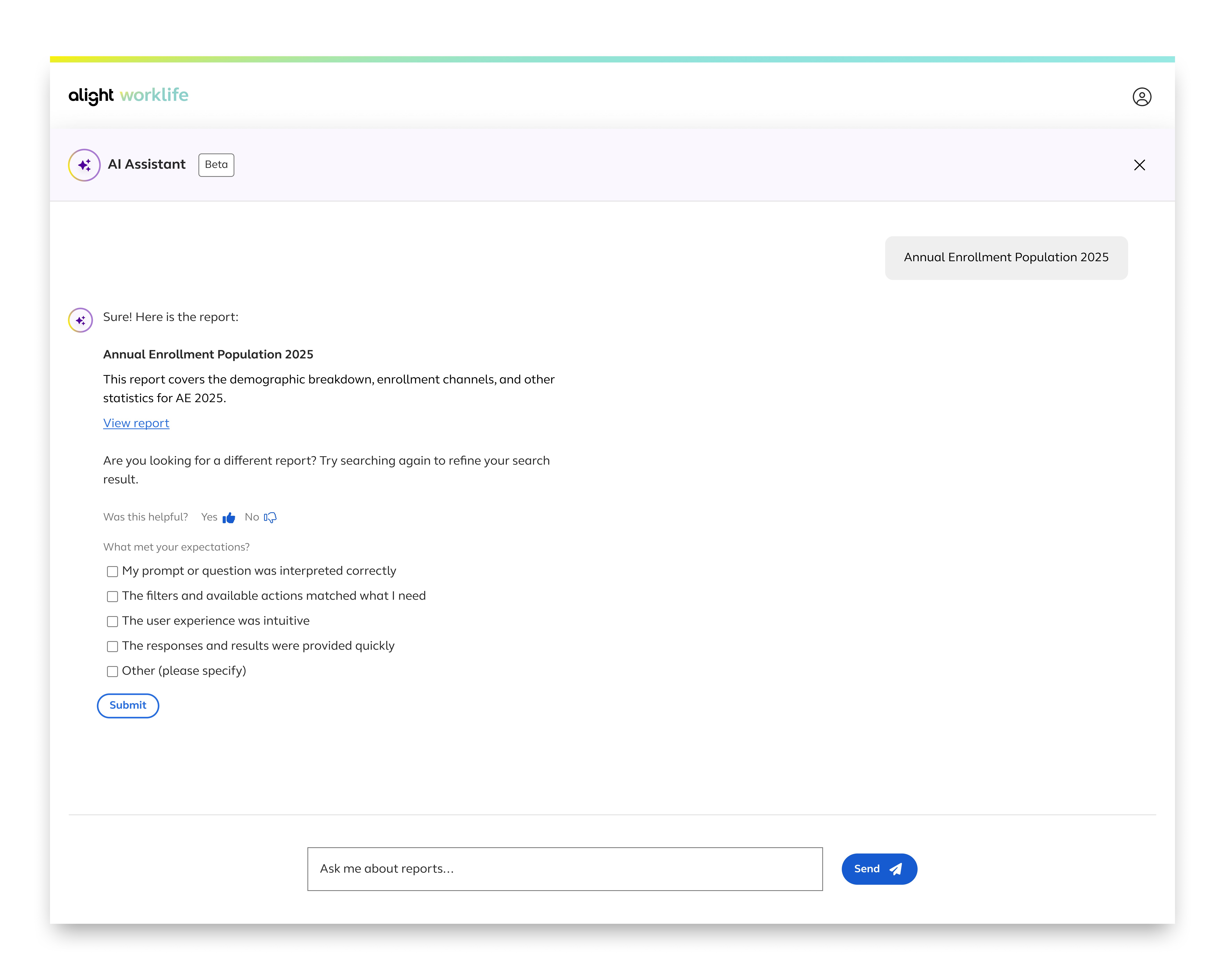
To ensure a polished and complete experience, I prioritized the inclusion of error states, loading indicators, and a feedback interaction.

Loading indicators
Loading states were intentionally included to communicate response delays, manage user expectations, and maintain engagement
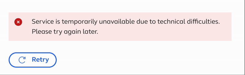
Error states
Feedback mechanism
Conclusion
Building an AI experience from the ground up required careful trade-offs across design and engineering. With time constraints as the primary external blocker, we prioritized simple full-screen layouts over dynamic side panes, guided prompts over fully open-ended interactions, and predictable behavior over advanced personalization. These choices allowed us to move quickly while staying aligned with core business goals: delivering measurable user value, accelerating client outcomes, and using AI to maintain trust and reliability with clients.
Impact
Client satisfaction and engagement
Alight Worklife Insights is used by 235 clients and data shows that Alight Assistant has reduced reporting turnaround time and improved client satisfaction/experience by 20%.
Some of our clients have provided feedback around their overall experience:

User experience and usability
Early feedback from 1,836 users showed strong confidence in the AI experience, with 97% of respondents rating accuracy and overall experience positively.
AI design foundations
This project set the foundations of AI design and interaction across different Alight platforms
Challenges and learnings
Avoiding the "shiny" AI trap
While AI often is viewed as a catch-all solution for delivering impressive capabilities, the reality is more nuanced. To ensure our product roadmap remained aligned with broader business objectives, PMs and I held regular check-ins and strategic conversations. This helped us stay focused on realistic outcomes rather than chasing the allure of a "shiny" new AI feature.
AI design is more than visual appeal
I initially thought designing for AI meant adding flashy visuals to signal intelligence. But true AI design goes deeper; it’s about crafting a strategic interaction model, grounded in purpose to enrich the user experience.
Designing for scale across platforms
The biggest challenge is remembering that the AI experience should be built to extend beyond analytics into domains like benefits enrollment. This required thoughtfully crafting flexible design patterns that can be adopted seamlessly across varied user contexts.